Wednesday 27th September - On-Line Media
Today we looked at on-line media, four websites were evaluated:
Each was assessed and consideration given to: ease of use, target audience, type of product (ie commercial, educational, entertainment), how it was made and whether or not it was a satisfying experience.
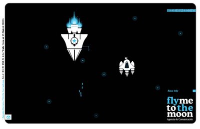
 In terms of style, my personal favorite was flymetothemoon, a promotional website for a Spanish PR and communication company. Using minimal colours, concentrating on black, white and blues they created an uncluttered and clean experience. The website has experimented with navigation elements based on a simple vertical scrolling, top down shooter arcade game (but unfortunately without the shooting). The user control's a space ship, docking at intervals to reveal information about the company. The ship looks great and as well as having a 3D feel, it gains upgrades after each docking. The main problem with the site is its speed, you cannot change the rate at which you travel up the screen and you have to dock and view information in a very linear way. I enjoyed the interface but would have liked to have been able to have more control over where I went and what I saw. This was availiable as an accelerator on the introduction screen but the controll of the ship was entirely lost.
The other sites were interesting but I wont go into too much detail. Billy Harvey's web site was flash, again with an experimental user interface. The user could zoom in and out of a set of Polaroid photos, clicking on them to listen to stories and songs from Mr Harvey. The cleverest thing about the site way the way Billy followed you from picture to picture, his lips in sink with the songs. A very nice site, but needed a HTML alternative or at least some text, it relied on audio which would make it unusable in a quiet office environment or for people with less than perfect hearing.
ownyourc was an American anti smoking site disguised as a forum and resource site. It was slow and confusing but the graphics did have a certain disturbed charm. It utilized a lot of different software packages, combining vector graphics with digital video and animation as well as sound but I was left confused and unable to navigate effectively. Having to load each section did not help with exploration of the site.
Carried on with research on Tim Berners-Lee for the remainder of the day, there is a lot of information on the web about him (unsurprisingly). I cannot decide whether to focus my presentation on his actual inventions (html, url's, http, the web) or his philosophy. I feel that someone would have invented the web sooner or later but what makes TBL important is his continued commitment to keeping the web accessible to all equally. The presentation is next Friday (6th October) so I will have to decide which direction to go in soon.
Thursday 28th September - Off-Line Media
 Off-line media is simply Media which is not net based. This includes DVD's, CD roms and computer games.
We evaluated the Heuristics (Jakob Nielson's usability rules of thumb) of a number of products: 2 DVD's, 2 CD roms and the Sony IToy. The iToy was entertaining and scored well, a lot of its appeal was due to the unusual user interface and chunky graphics. Some of the other products faired less well. The John Malcovich DVD had a button system which seems to have been enforced on it by the stodio. It sat uncomfortably with the look and feel of the menus and navigation would have been clearer without it. The CD roms were both poorly designed in terms of usability, in alot of cases the user was left usure were to click, buttons were frequently indistinguishable from other graphial elements
Heuristics are a very interesting and important area and one which I will consider when creating my presentation for neat Friday. A status bar at the bottom of the screen may be useful to allow the audience to know far through the presentation I am, and that I wont be talking all day.
Carried on with TBL research for a lot of the day, most articles are now repeating things I already know but there are occational gems. I need some sound or video footage to create a richer experience for my audience.
Friday 29th September - Health and Safety
Spent the whole morning at a health and safety work shop, mainly common sense general information about manual handling and computer use. Some good BBC videos about camera work, not as cheesy as most company H+S films.
More TBL research and blog writing this afternoon. Will try to get some structure to my presentation by Monday.


0 Comments:
Post a Comment
<< Home