Tuesday, October 31, 2006

Monday 23rd - Friday 27th October - Dreamweaver

this week was scheduled for Dreamweaver. Steve Jones taught us all week covering the basics of HTML CSS and the Dreamweaver user interface. I had already had quite a bit of training and practice using HTML and basic CSS so I found this week fairly straight forward. But it was still very useful and it helped me to refresh my knowledge especially with CSS layouts.

The relatively easy week also gave me time to catch up on my Maya work which I worked on all week. I endlessly tweaked my project but I am very happy with what I have achieved in what I consider to be a short time. I think my previous experience with another AutoDesk product - autoCAD helped me , I have used quite a few CAD programs working with maps and buildings.Once I have finished the modeling and animation I need to work out how the music will fit in.

Using Dreamweaver was much better than I expected, my previous experience has been like using MS Word. The package assumes the user doesn't know what they want and constantly tries to help out, normally with un wanted results. But this week I really saw the benefit of using Dreamweaver above just typing your HTML and CSS into a text pad. It was much quicker to write code in HTML and I made less mistakes with spelling and missing off closing brackets etc. So I will be using Dreamweaver from now on to wright my HTML and CSS. Steve Jones was very helpful this week and it will be great top have him around for the next few weeks as we complete our neat assignment.

Monday 16th - Friday 20nd October - Maya

This we were taught Maya. Matt taught us this 3D package for 3 days covering a lot of the content of the package including:

- Rendering
- Particle effects
- Animation
- Modeling

The package was vast and it was easy to become confused by all the menu's, the biggest problem was finding the feature you wanted. I spent a lot of time hunting through menu's and tables as well as the help trying to find what I was after. Matt was a great teacher and he was very clear and enthusiastic. He was inspiring and the first 3 days went by very quickly even though a lot was packed in.

The last 2 days were concerned with getting on with a brief. The brief was too complete a 10 second ident for a fictional music channel of our choice. I have had a few ideas but decided to base mine on a rock channel called BOOM MUSIC. I had the idea of starting with a wire and following a buldge up its length until it enters the back of the speaker. The camera then spins round the speaker and revels that the wire links the speaker to some large words- boom music. A tag line also had to be include. I really enjoyed this brief, it was sometimes frustrating but I think I have a natural aptitude for working in 3D, possibly something to do with my dislexia.

I got the majority of the modeling done in 2 days which was great. It was a good idea to stick with a simple idea and do it well. One obstacle when starting the brief was knowing how long it would take to model and animate. As I had never used the program before I had no idea how long things took and in that respect my solution to the brief was a good one. I was able to add detail or remove it depending on time.

Monday, October 23, 2006

Monday 9th - Friday 13th October - Digital Story's

Digital story's are 2 minute long, first person story's with accompanying images. My chosen subject was the cycling trip I took across Wales last year. It was a great experience and I have loads of photos to accompany it.

Monday and Tuesday were centered around writing the script. I found this very hard, IM not a confident writer and I got extremely frustrated with myself. But I eventually got a script down and recorded it on Wednesday. I have written my script in 3 parts - The first part explains what im doing and is very calm, the sun is shining and the landscape is very flat. The second part sudenly jumps into a first person list, is was trying to capture the feeling that the aurdience was actually there with me at I struggled in the rain. The third part jumps back to Cardiff and sums up how I felt about the experience. I Will atempt to add my final video to U-tube later on in the week.

I found the whole experience very difficult but I have learnt a lot and produced something which im quite happy with. If I did it again tomorrow I think I would be able to create something much more stylized and with a lot less stress.

Wednesday 4th - Friday 6th October - BBC

I have just spent 1 hour updating this blogg, tried to spell check it and lost the lot, I think I will stick to bad spelling in the future.

We worked on our digital story's Wednesday, Thursday and Friday and 4 were presented on Friday afternoon. These were-
  1. Vannevar Bush - An American who developed a link between scientists, the government and the military during the second world war. This led to a lot of technological advances being developed for the military. These have subsequently filtered down into the public domain (eg the internet).He also designed a machine called the MEMEX, which allowed a user to store links between documents.
  2. Ted Nelson - coined the term hypertext, thinks that bereners lee's web is a gross simplification of his hyper text idea.

  3. Douglas Englebart - Performed the "mother of all demos" in 1968. demostrated the first mouse and user interface so a user could interact with a computer. The screen was 20ft high and 1000 people turned up.

  4. Alan Kay - American computer scientist who pioneered the graphical user interface and object orientated programming. Currently working on clockwork laptops for the third world.


Our Visit to BBC interactive was very interesting this week. We were given presentations from a variety of people from the department including project managers, developers and designers. It was a very friendly environment and people obviously enjoyed working there. I hope to go back in a couple of months when im a bit more settled.

Monday, October 09, 2006

Monday 2nd October - PhotoShop

Most of the day was taken up with photoshop training. I think like me, everyone in the group had used photoshop before. But luckily the training was quite fast moving and I picked up a few useful tips and shortcuts. There were also a few features which I was aware of but had not really used, for instance, in the past I have always fiddled around with the contrast, hue, intensity etc of the image straight through the menu bar. But I realized the benefits of using adjustment layers, its useful to work in a non-destructive way, always retaining the original image.

In the afternoon we were free to use the skills we had learnt to alter an existing image. I was quite pleased with my attempt although the monk in the door way still doesn't quite fit, I think he is too bright.
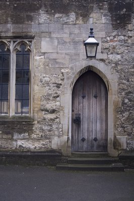


Before
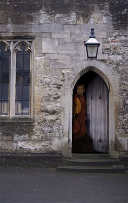

After
the monks are from some photos I downloaded from flickr.com, our trainer Ben Griesley (sorry if thats spelt wrong) provided the original doorway image. The training enjoyable and useful.

At about 4pm we went to visit S4C (channel 4 Wales), they had a regular team of 3 people working on the channels web site. Their biggest design problem is the need to make everything in both English and Welsh, If they design a page in English and then translate it the design can be destroyed due to welsh having more and often larger words. This is an issue with all company's in Wales who have to produce dual language material in everything they do.
It was an interesting visit, S4C don't actually make any programs, they are all commissioned or they use English channel 4 programming. This creates a problem with copyright, and getting permission to promote programs though the web. In the past a programs web site and presence on the world wide web has not been considered until after its was completed and all the crew had gone home. This makes it hard to gather material for the web site. There is now a move toward producing the web site whilst filming so that extra material can be produced and the site is not just repeating what the program has shown.


Tuesday 3rd October - illustrator

The whole of Tuesday was taken up with Adobe illustrator training. Its a great package but I found it harder to use than another vector graphics program I have used - CorelDRAW. The benefits of illustrator are that it has a layers system similar to photoshop and transferring things between photoshop and illustrator is easer. Also, having the same shortcuts on both programs is very useful, If im not concentrating I sometimes try to use photoshop tutorials within corelDRAW. The main drawback with illustrator is the very large and confusing menu system, things seem to get lost very easily and for a novice user you spend a lot of time hunting through menu's trying to find the tool you need. The other problem I have with illustrator is working with curves and lines, You have too be very precise with your clicking and always keep an eye on which type of tool you have selected. CorelDRAW seems too be more forgiving and use fewer tools to achieve the same ends.
But, I will switch to illustrator because it seems to be the industry standard and IM sure that as I become more comfortable with the software I will find it less frustrating to use. I played around with a few ideas but I was generally felling uninspired. Here is an orange and a cup, sorry not very exiting.



It was another useful training session and I don't hate illurstator as much as I did.

We were also given a new brief today, to produce a mock up using graphics software of a game or website with the theme of lunch hour. School dinners spring to mind with an educational element inspired by Jamie Oliver but maybe that's a bit dull and obvious.